Pantone’s colour of the year is always a big moment in the design world, a juncture that aims to capture the collective mood and sum up the year ahead.
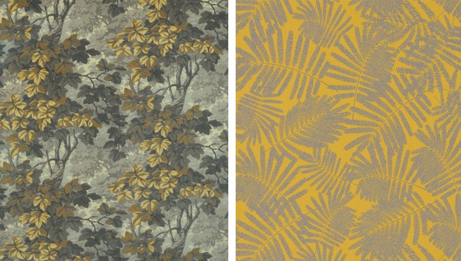
Ultimate Gray (Pantone17-5104) and Illuminating (Pantone 13-0647), an optimistic hue of yellow, are the two shades that Pantone has named as its colours of the year for 2021. This is only the second time in the 22 years that Pantone has chosen two colours.

The selection of two independent colours is conveying the idea that it’s not about one colour or one person, it’s about more than one," said Leatrice Eiseman, executive director of the Pantone Color Institute.
It also highlights how different elements come together to express a message of strength and hopefulness that is both enduring and uplifting. The warming yellow shade makes us think of better times ahead evoking the optimistic promise of a sunshine-filled days, while Pantone has compared “ultimate grey” to natural elements, such as stones on the beach, which brings a feeling of steadiness and resilience.
Each year the newly announced shades filter through into home inspiration whether it is through soft furnishings or permanent fixtures.
A vibrant yellow can be a difficult colour to work with in large areas, incorporating strong hues as accents adds interest and depth without overwhelming a space. Art, soft furnishings and even lighting are easy ways to experiment. Wallpaper can also completely change the look and feel of a room, and in recent years statement walls have become a popular trend. We love Richmond by Zoffany and Espinillo by Harlequin.
Grey has long been favoured as a prominent colour for timeless design schemes to create a sophisticated, calming pallet. The concern for many people is that this can result in dull or flat interiors. The key to working with grey (or any neutrals for that matter) is to ensure they are layered, using different textures and prints to create visual interest.

Whether you embrace bold swathes of colour or prefer subtle accents, combining Ultimate Gray and Illuminating would be a great way to incorporate a neutral tone with a contrasting colour to add dimension and liven up a space.


Comentarios